AO1 - Contextual Understanding
Developing ideas through sustained and focused investigations informed by contextual and other sources, demonstrating analytical ad critical understanding.
Ideas Pages
After brainstorming the theme of overlapping I began to put some of the ideas together. I thought of some potential ideas for images and came up with overlapping emotions and expressions.


Florian Imgrund - Double Exposure Photography.


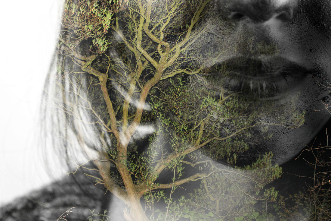
Florian Imgrund is a German photographer who his most famous for his double exposed, black and white photographs. All his double exposure work is done using a camera and not edited using photoshop. He often merges close ups of human forms with natural landscape photographs.
Sergio Andretti


Sergio Andretti is a photographer who, in this series, used an effect to make his models look almost and fully jet black, some of these photographs makes the model look as if they were a silhouette. He used contrasting colour of clothes, jewellery and features to enhance the colour of the skin such as, glasses, smoke, and rings. In some of the pictures in this series he made the skin look oily/greasy, this made the veins and hair stand out making the arm and hands look more textured. I found this series of work very interesting as its unusual. It is both surreal and intriguing to look at.
AO2 - Creative Making
Experiment with and select appropriate resources , media,materials ,techniques and processes , reviewing and refining their ideas as the work develops.
Florian Imgrund Inspired Photo shoot


After doing artist research I decided to experiment with photoshop and replicated the work of Florian Imgrund. For this experiment I needed to do two photoshoots. I had taken photographs of trees, inspired by the background of Imgrunds images of forests and nature, and also like Imgrund I had taken some portrait photographs.
Photoshop Editing


|
To experiment with the work of Imgrund, I used Photoshop. I simply placed the photographs on top of each other and set it to screen. This gave an effect where it looked as if the images were fading into each other. I made these layers black and white, I did this because I used three different images and thought the end result would look like there was too much going on and would make the picture looks messy and confusing.
|
Sergio Andretti Inspired Photo shoot.
|
After I looked at Sergio Andretti's series of photographs I wanted to replicate or work in the style of his images. I noticed in his work he made the skin look a metallic black and almost oily, this enhanced the prints in the skin and made it look more detailed and textured. He contrasted the skin with a white background and white clothes, because of this I dressed my model in a white shirt before painting her skin using black acrylic paint. Before painting her I covered her skin with oil to ensure that it wouldn't dry and crack, this also helped make the skin look smoother, and reflected light better.
|
|
AO3 - Reflective Recording
Record in visual and/or other forms ideas, observations, and insights relevant to intentions demonstrating an ability to reflect on work and progress


Overlapping Photoshop Experimentation.
|
|
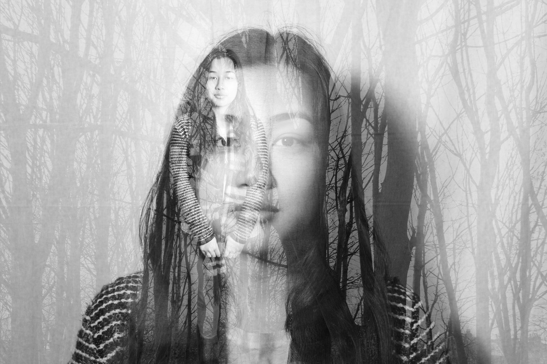
I did another shoot inspired by Imgrunds use of double exposure, however I decided to experiment using an idea that was slightly different. Instead of using two different photographs that contrasted in scene and focus, I used the same image twice. I took some portrait images and layered them on top of eau other, again setting it to screen, but had one of the pictures moved to the side slightly. I then changed the colour of one of them to show the difference in alignment. This created an effect which made the image looks like it had a shadow.
|
Overlapping Expressions


|
In this photo shoot I used two different models and had them show a variety or expressions. I wanted to show contrasts and differences in emotions. From looking at Imgrund's double exposed photographs and the ideas I got from overlapping I decided the use two different images of the same model but showing different emotions and expressions in their face. I 'screened' the images on top of each other using photoshop to show the effect of them fading into each other. I then made the photograph of them with a blank or no expression black and white. I think that this enhanced the dull feeling and expression in the face which made the other face with the expression look more extreme.
|
|
Florian Imgrund Inspired Photo shoot


|
|
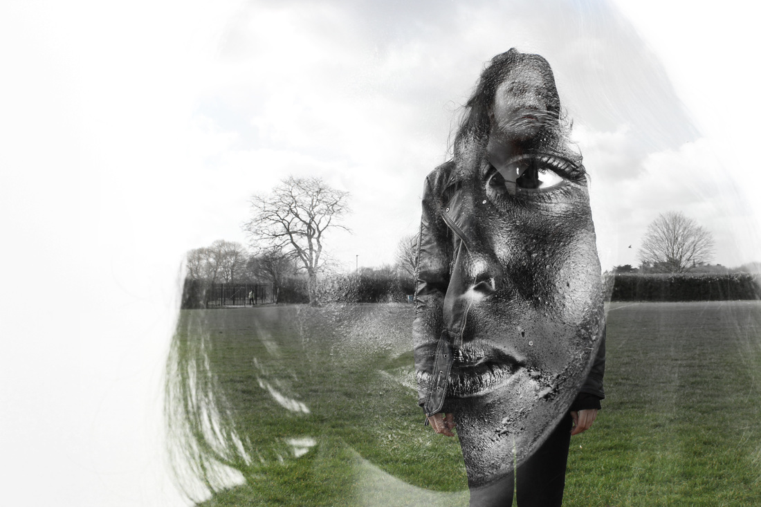
Inspired by Imgrund's work and after already experimenting with two close up portrait photographs I then tried a far and a close up image. In the long shot images I wanted to show a landscape image so I did half of my photo shoot outside with my model in front of a natural scene. Again, I screened the images on top of each other. I positioned the long shot image with the body in the middle of the face, this made the features of the face that was on the body clearer.
|
Combining Artists
|
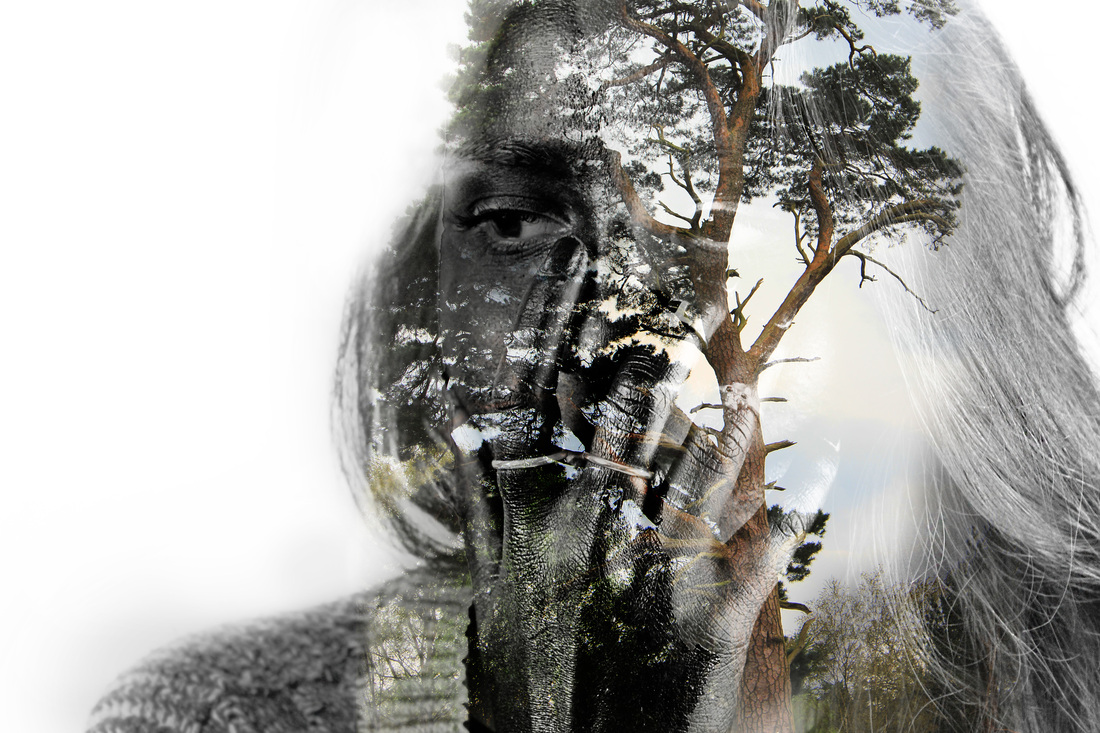
I then experimented combining work of the two artists. I used the screening effect on photoshop to layer the trees with the painted model. Because of the bright coloured shirt, the trees were able to fade in to it from the background.
|
|
Sergio Andretti Inspired Photo shoot
|
|
I decided to go back to the work of Sergio Andretti and experiment more with texture using paint. Although these photographs are not as smooth and dark in colour as Andretti's I was still inspired by the idea using metallic, surreal colours on the skin. I did more close ups in this shoot as I wanted to focus on the features and face itself instead of the expressions. I used a white background and had silver, on the ring and parts of the jacket, to enhance the colour of her skin.
|
Combining Artists
|
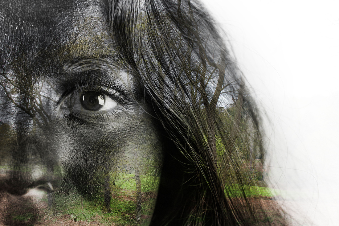
When I overlapped my photographs with the trees I first thought that there was too much detail of the trees in the face which made it looks messy and overcrowded and also took away the attention of the features and paint. From this, I tried editing the portraits using the pictures of the trees after I inverted the colour of them. This made the features more noticeable but showed the branches in the background instead. It kept the dark, bold colour and texture.
|
|
|
|
Using photoshop, I inverted the colour of the photographs I had taken of the black paint. I experimented to see if it could lead to another idea, however, I did not really like how they appeared. Although it displayed the texture and colour of her face well, I think that the inverted colour on particular features such as the eyes made the image come off as scary which is not my intention.
|
Final Ideas


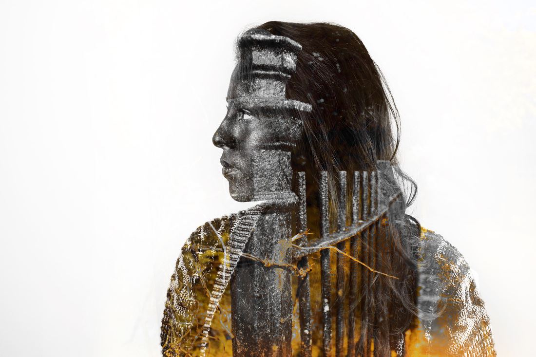
Once the sun had started to set, I went out and took some landscape photographs as I thought the dark settings would edit well along with the Andretti inspired shoots. Most of the photographs in this shoot were taken in a park and a nearby alley way. I think I had taken and found some useful pictures as some of the things were very textured, such as the gates and trees.
|
|
I photoshopped some of the photographs I had taken of the bridge and fences with the Andretti inspired photos using the screen and overlay setting. This faded the picures into each other while still displaying the texture and colour. From this experiment I found out that if the background is black or dark it would blend in better into the face as I had used black paint. This had helped me take and decide what images I would use for a final piece.
|
AO4 - Personal Presentation
Present a personal, informed and meaningful response demonstrating critical understanding, realising intentions and, where appropriate, making connections between visual, written, oral or other elements